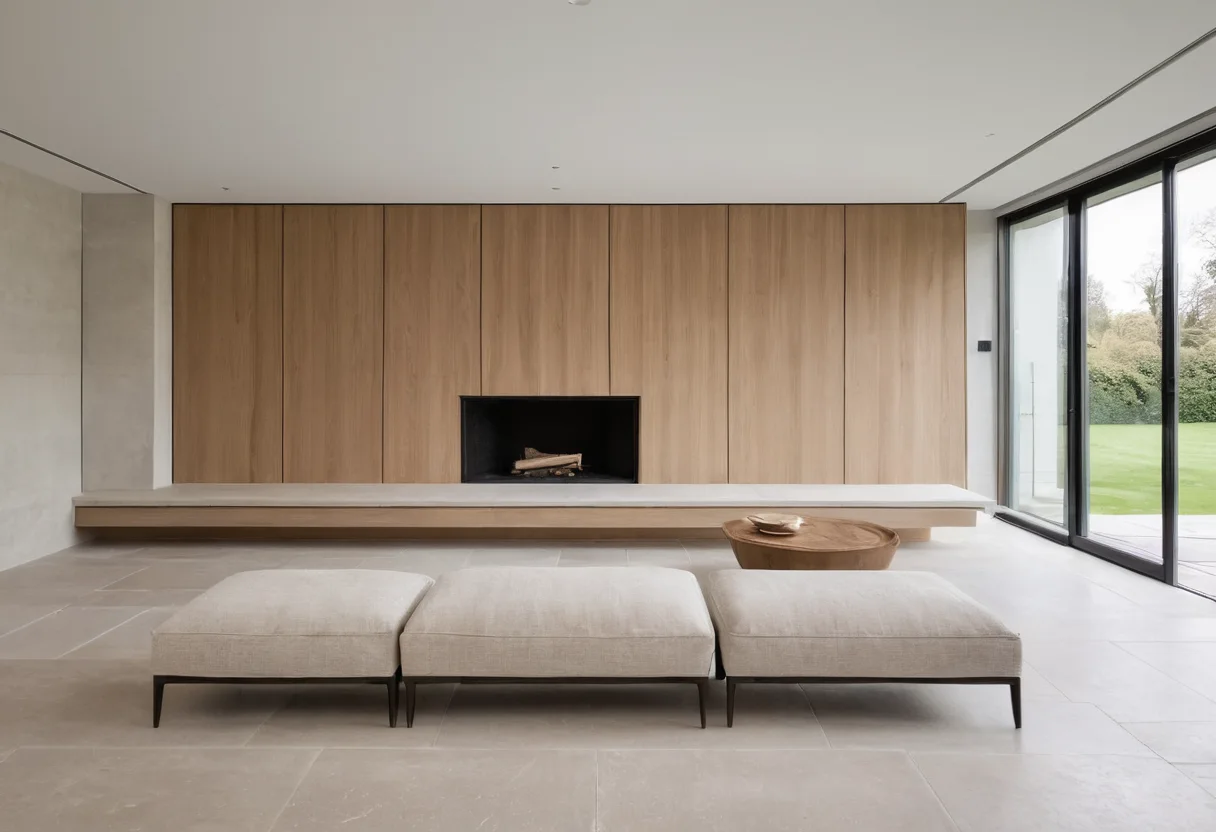
Strip a room of cushions, flowers and coffee-table books and its real quality becomes easier to read. Quiet luxury is not a beige palette. It is the cumulative effect of proportions that settle the eye, materials that meet cleanly and objects that do not have to compete for attention.
Begin with the empty elevation
Photograph each wall straight on. Door heads, cabinet lines, switches and reveals should appear to belong to one drawing. This is the same discipline examined in the final alignment review: small relationships become the visual background against which everything else is judged.
Next, study weight rather than symmetry. A tall cabinet can be balanced by a low sofa and an open stretch of wall; it does not need an identical object opposite. The distinction between symmetry and visual balance explains why many restrained rooms are deliberately uneven.
Material confidence
Restraint makes weak material decisions more visible. Timber cannot hide behind accessories, and stone becomes architecture rather than pattern. Before combining species or stains, use the undertone and repetition test in our guide to mixing timber tones. For natural stone, slab selection must happen before cutting; the complete process is described in how marble slabs are chosen.
Leave something alone
A quiet room needs at least one surface that is allowed to remain background. The argument for one visually unfinished wall is not minimalism for its own sake. It gives daylight, furniture and art enough separation to be understood.
The test is simple: if the room still feels coherent after the styling layer is removed, its calm belongs to the design. If it collapses, the accessories were doing architectural work.